Video Review:
Text Review:
Washington Wildlife & Recreation Coalition (http://wildliferecreation.org/) is a unique organization with a GREAT looking website. As I mentioned in the video, any critique of what they are doing absolutely does not include what they are doing aesthetically. In a word, their website is gorgeous and their photography is truly outstanding. In a way, this is the main challenge the site has, being more than a pretty picture.
Connect the Dots
The majority of my feedback on this site has to do with their communication style, that is, I would love to have them “show” more than they tell. With the exception of their homepage, which uses text VERY sparingly, their site has plenty of data and other information about what they do. Even though there is plenty of content, I found myself being trusted to come conclusions on my own. That is, I found the way they told their story to be disjointed and it really lacked the compelling punch that I would want to see before I got involved with what they are doing.

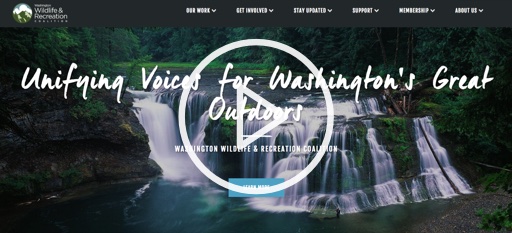
With regard to their homepage, I had issues with the lack of explaining what they, as an organization did. More importantly, I also have an issue with the lack of discussion about what impact they created in the world. Taking the top header image as an example “Unifying Voices for Washington’s Great Outdoors” is beautiful prose, but I don’t know what it means. What problem are they solving? How are they solving it? How is the world different because of their efforts? How do they need my help?
Where’s the Beef?
In the “slide” under the home header was an image and call to action for an upcoming event. If it were me designing the site, I would have put some brief explainer text (with statistics, etc.) about what they did and the impact they created. I would have followed this with a level deeper explanation, perhaps with a specific project example. To my thinking, by unfolding the narrative of what they did this way, they would lead people in by highlighting the impacts they created (both generally and specifically).
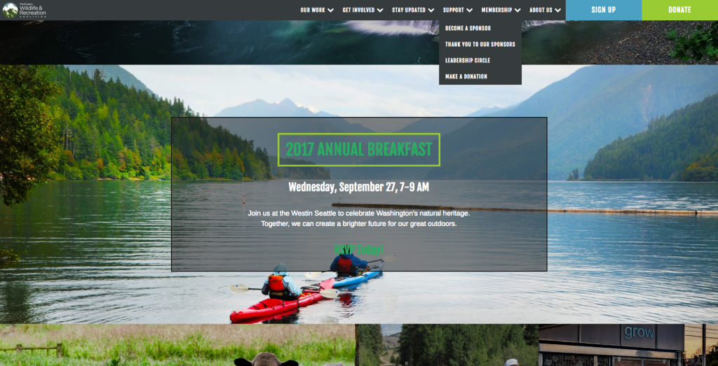
Scrolling down the page they feature their projects, but this does not tell me any more about what they do. Of course, I can click on these projects and learn more, but even the presentation here is problematic too. More on that in a second.
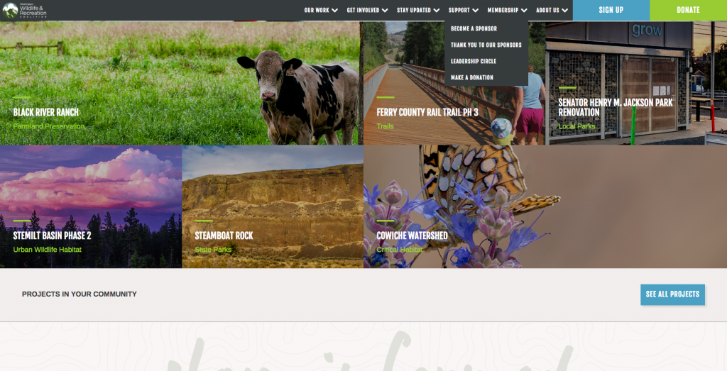
Actually, in my mind, the most interesting part of the homepage is that small section at the bottom titled “Projects in Your Community”. Clicking on this allows you to view an interactive map, which shows the projects by county. This is great! This really helps connect me with their mission and impact, specifically with projects that I have probably seen and/or use. However, personally, I found the map itself a little slow and clunky to use and I found it VERY easy to come to the conclusion that there were no projects for several counties (more about this in the video).
Passivity Dilutes Messages
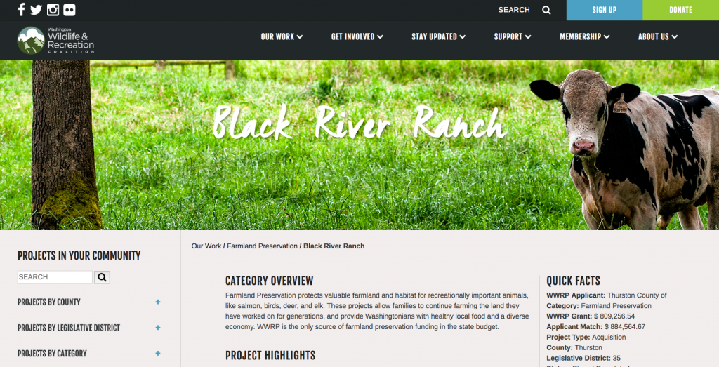
Clicking on the project pages I am presented with beautiful photography in the header, but then several paragraphs of text, and summary information that is not showing me the impact I am looking for. In a word, I found the website to come off as quite passive. I didn’t feel like it was asking me to do anything, and I didn’t really feel that they needed a lot of help, since I didn’t feel they were asking me for anything. I was treated to beautiful photography, and I learned about an organization that seemed to be doing interesting things, but I wasn’t compelled to act or get involved.
Give Me Something To Do
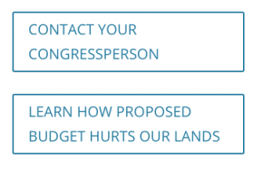
On their “Take Action” page I had similar issues. Lots of text, with text links, but no calls to action. Since all of the links were text links they were very easy to skip over. Especially if I am only skimming the page, I would miss them completely.
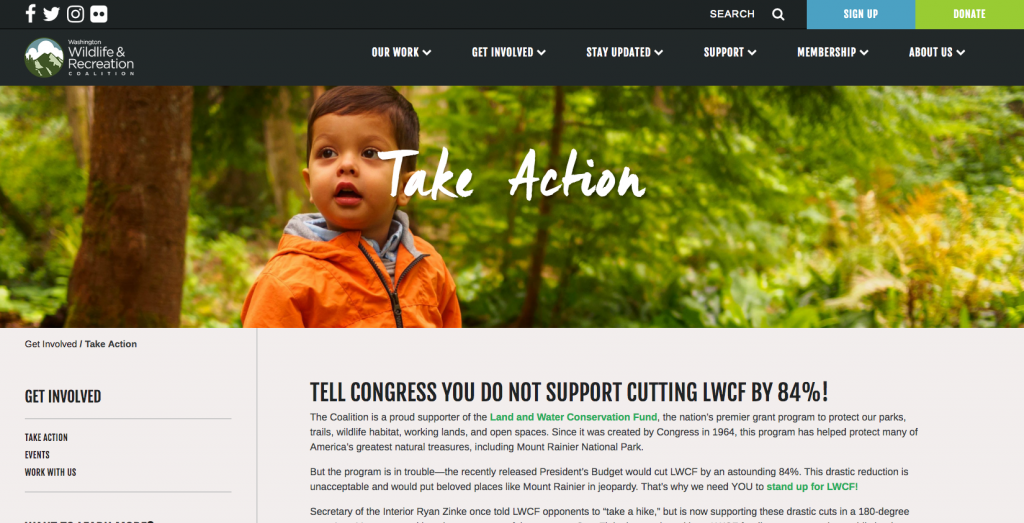
For example, I would have loved to see a few of these intermixed with the text (to both break up the text AND give me a call to action to respond to):
Donation Friction
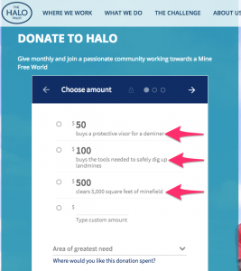
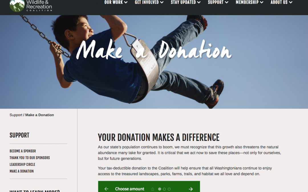
Washington Wildlife & Recreation Coalition uses Donorbox for their online donations, which is a very good platform. As I’ve mentioned in other DX Site Reviews, I really like how Donorbox allows you to specify what each level of donation can be used for. To me, this not only makes giving more “real”, but it also compels me to give more than I would have. It inspires me to go up a level or two. Here’s an example of Donorbox with those levels:
However, for some reason, Washington Wildlife & Recreation Coalition decided not to use those descriptions in their funding levels. To me, this really misses an opportunity to make the donation more meaningful (by connecting the donation with community improvement)
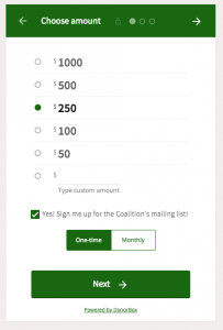
Additionally, when I tested the donation form, it was VERY slow to load (e.g. 20-30 seconds) on several occasions. You can see this in the video and although this did not happen every time (when I made my original donation everything worked fine), it is still concerning. That is, this is the main drawback of using a third-party online donation system, it is another point of failure. So, even if your website is up, if the third-party is down (or, something in between me and the third party is down) the donation function simply does not work.
Additionally, and this is not a knock on Washington Wildlife & Recreation Coalition, I take a bit of an issue with how Donorbox splits their donation form up into multiple screens. My instinct, when I am building donation forms, is to make them a single-page checkout (that is, they do not require hitting a “next” button). Admittedly, this is a holdover from my days of working in ecommerce, but I have to think that a streamlined “checkout” process only can help keep abandoned donations to a minimum. At the very least, this would be something I would test (Donorbox vs. a single-page donation form).
While we’re talking about forms, really quick, I also take a bit of an issue with their newsletter signup form. Again, this dates back to my ecommerce days (and before), but it is ALWAYS my preference to ask for as little information on signup forms as possible. Their form asks for several fields worth of information and I wonder how many more signups they would get if they just asked for an email address?
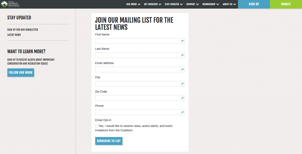
(granted, I know this is how they do it in the footer, I just wonder how many more signups they would get by doing this globally)
Wrapping Up
I feel like I have been a little hard on Washington Wildlife & Recreation Coalition, and that’s not my intent. Their site is beautiful, so clearly they have a lot of talent working for them, which I think has made me a little more critical than normal. That is, I can see them going from a good site to a great one and they seem to have all of the pieces to make it so. Also, I see this is a reasonably common problem with websites these days, where the aesthetics are absolutely nailed, but the directness of the communication leaves a little something to be desired.
The video goes into more detail, but in a nutshell, if this website connected the dots for me more, as a donor, I would be much more compelled to act. I believe this site has the potential to be something really special, and if the communication was more direct, and the impact was summarized and presented more clearly, I believe this site could be a donation and support attracting powerhouse.

Trackbacks/Pingbacks