Video Review:
Text Review:
Homeboy Industries is amazing. Not only in the work they do (which is both myriad and incredibly impactful), but also in the presentation of themselves online. In a word, their website offers an outstanding donor experience. Clearly, they have really thought through the interactions their donors have with them, and I find that they have really nailed about 90% of what you can do to pull off a great donor experience online. Let’s go over how:
Succinct and Powerful
Homeboy clearly understands how the axiom “less is more” really applies to website text. Their site weaves together every element, from text to photography, from infographics to video; to weave together a cohesive, compelling story about who they are, what they do, and why you should help.
Homeboy is a large organization, at least the way I would think about it. According to Guidestar, their gross receipts for last year were about $16M. As such, as an organization, they have the size to pull off really, really great website projects. What is unique about Homeboy, though, is that they have both the size as well as the appetite to create something great.
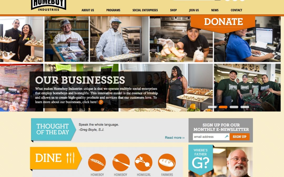
Case in point, their homepage uses graphics and minimal text, allowing visitors to find which area they want to dive into. The homepage, thus, is light, lean, and invites discovery. We lecture, *ahem*, **advise** clients about how to do this often, and the Homeboy Industries site is a great example of brevity in motion.
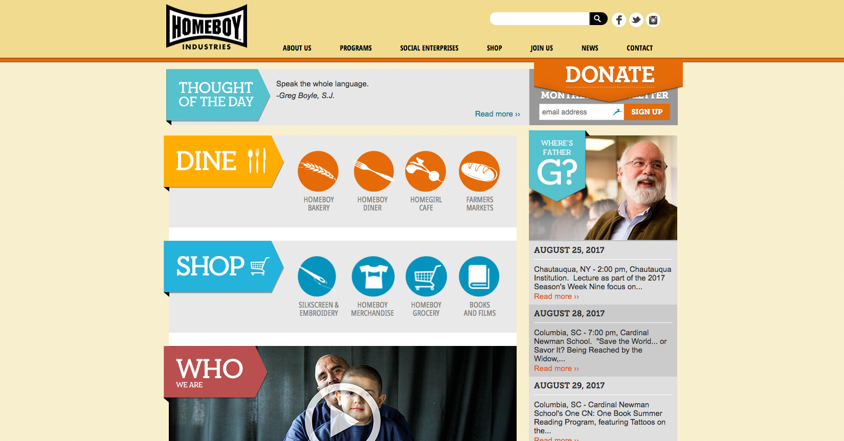
Overall, the site is very well laid-out and easy to explore. It made sense where everything was and the story of Homeboy unfolded more and more as I explored the site.
Compelling Stories
One of the best things about the site is the way Homeboy put a human face on the impacts they create. This starts with the great video they have on their homepage and continues with the personal stories section under “About Us”
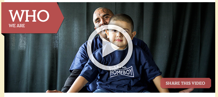
My only complaint with these stories is that I wish they were more prominent on the site. For me, putting them in a sub-section of the site is burying the lede. If you were asking me, I would find a way to get these stories on the homepage, making them video elements (e.g. a video library) to explore.
Online Donation Process Strengths & Weaknesses
The donate button is prominent on the page and it pays off the intent to donate extremely well. That is, once I hit the “Donate” button, everything else gets out of my way and I am able to fulfill the intent of that gift very quickly and easily.
The donation form itself is very simple, which is fantastic. Again, it allows me to pay off the intent of giving that much faster. I love how they use buttons for the donation amount, which is especially handy on mobile.
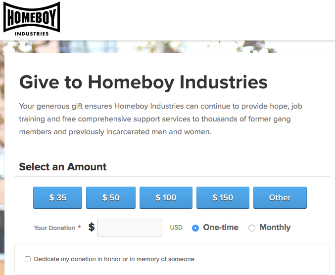
The donation form/process they use is offered by a third-party company called “Classy”. This platform offers some pretty powerful integration features, the ability to host events, and the pricing seems very reasonable. All and all, it seems like a great platform.
I only have a couple of issues with the donation form. First, although it was very usable on mobile, it didn’t seem to accept Apple Pay. For impromptu giving (e.g. at an event), making mobile giving as fast/easy as possible is a very good thing.
Additionally, and this is a product of using a third-party form that isn’t integrated into the website, when I click on the donate button, I cannot get back to the site through any links on the page. Of course, since this opened in a new tab (from the main “Donate” button on the site), I can just switch back to the other tab. However, there are places where the link to the donation page does not open in a new tab, which creates a true “dead end street” situation.
I bring this up because, often, donors look over the donation form before they give. As such, it is often nice to allow them to jump to/from the form easily.
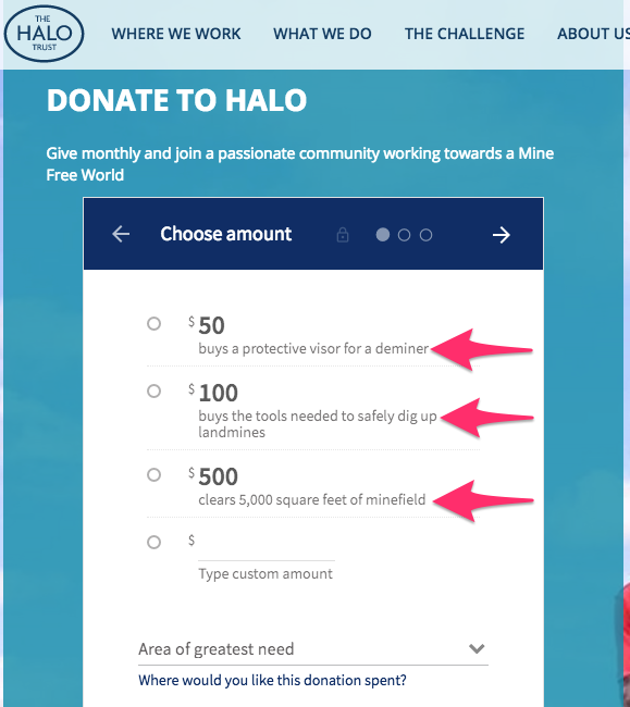
More generally on the donation form, I would have loved to see specific examples of what each donation amount does. That is, I know $100 is $100, but what would that $100 “do”? Here is an example from another site that I think does a good job of this (they use a platform called Donorbox):
Clicking around the site, it is also possible to get “behind” the donation form. That is, from Homeboy subsites (e.g. https://www.homeboyfoods.com), the donation form is totally different (this does not use Classy, instead it seems to be using the Homeboy Foods ecommerce engine):
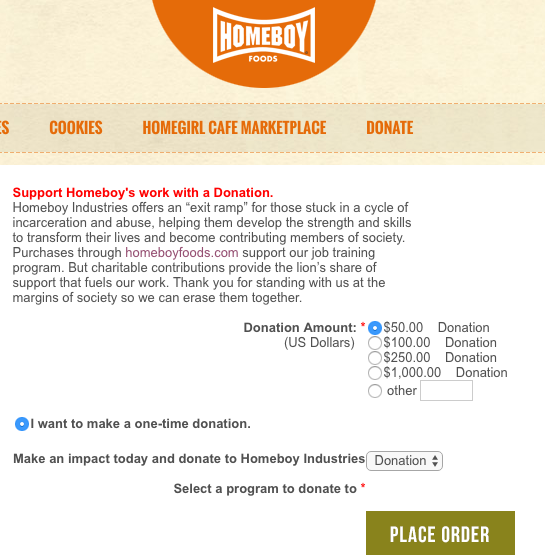
Put simply, the experience on this form is not even close to as good as the main donation page. As such, it underscores the importance of building a single great donation experience then making sure that every donation link points to it.
After donation, the process is very clear in telling me what happened and what I can expect next. Additionally, on the page as well as in the email I get from Homeboy, there is a sincere thank you as well as social media links to keep up with them.
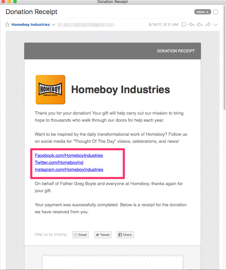
Personally, I would have liked to see a newsletter signup here allowing me to see the impact of gifts like mine down the road. Anything sites like this can do to connect the dots, to clearly show me how donations like mine are making a real, measurable impact, the better. By keeping in touch this way, I am not only inspired to give more in the future, I will feel better and better about past gifts as well as my involvement with the organization as a whole.
Wrapping Up
The video goes into more detail, but in a word, this site is fantastic. What they have done is hard to do. They have managed to tell a complicated, multi-part story in a succinct and compelling way. Not only that, they make giving to them easy.
Are there things that could be improved? Well of course. But, in my opinion, it is just the last 10%, which is exactly where organizations want to be. Organizations want to be in a place where they nail the first 90% (then occupy themselves with chasing the other 10% in perpetuity). Homeboy Industries not only does amazing work in the world, they have done amazing work with their website, especially in ways that they inspire and allow others to support them.

Trackbacks/Pingbacks