Video Review:
Text Review:
Spark Central is a great organization. Full disclosure, I am a big fan of Spark Central. I go there somewhat often, I utilize a couple of their programs, and I’m actually going to an event there tonight. I believe this bias plays out in this review of being even more sensitive to the missed opportunities in their communication to show people all that Spark Central really is. To me, the full picture of what Spark Central is gets lost in sparse design and “burying the lede” in the content of the site.
Upside Down Content Design
I do not mean to come across as overly critical of Spark Central. They have a beautiful website, with great photography and an interesting mission and programs. Like a lot of modern websites, though, the communication gets lost when designs are too sparse. It’s true that the average website visitor does not want to read your paragraphs of text, especially on the home/main pages. However, the opposite of the problem is not the solution. And, I just found myself, over and over, finding really engaging and illuminating content buried at the bottom of sub-pages of the site. As such, my main recommendation to Spark Central is to flip this over, to restructure their content to tell more of their story up-front, to be more direct with their communication, to hit the impactful truth of what they are doing first (and then fill in details on subsequent sections/pages).
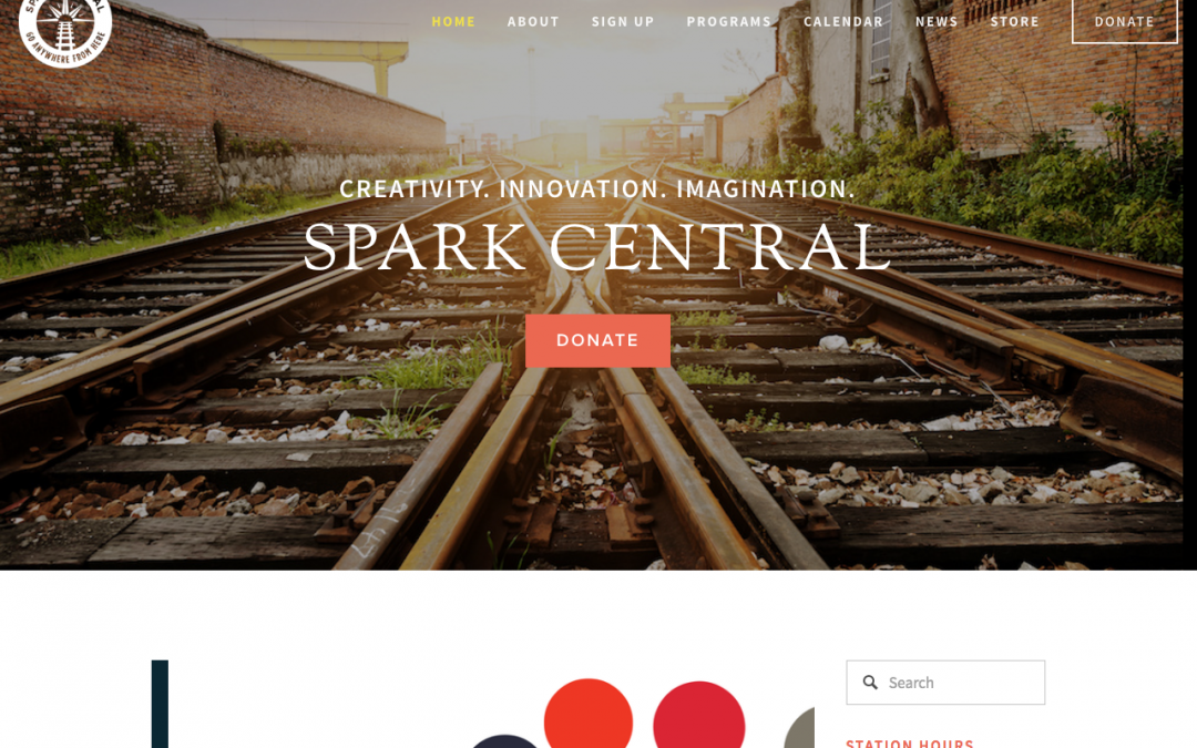
Starting with the homepage, like a lot of modern sites, I find the top half of the page isn’t really telling me much, if anything, about what they do. The words “Creativity. Innovation. Imagination.” are all wonderful ideas, but I don’t know what they mean, in this context. Looking at the home page as a whole, I have to scroll down to the bottom to even begin to get a feel for what Spark Central is, and even then, I don’t think I really have the organization painted clearly.
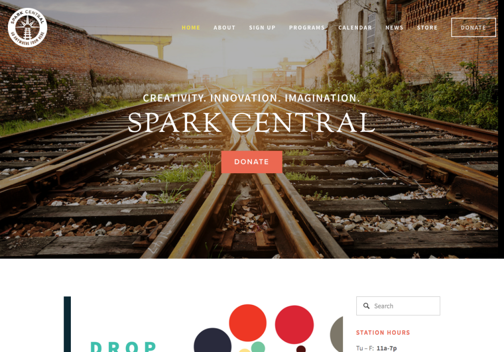
My guess is that this content strategy is by design. My read of this type of presentation is a strategy of starting with vague ambiguity, allowing visitors to unpeel layers of clarity and understanding as they go along. Maybe I’m reading into this too much, but this treatment feels a lot like a novel or a film, start with some mystery, pepper in some vague clues about the organization, then reward readers later with clarity and understanding. To my way of thinking, this is backward. Personally, I like to reward readers first, giving them a reason to read on that is earned. In that way, website communications feel more like conversations (or news articles) to me. Hit me with your strongest point first, then backfill more of your story later.
On the top of the homepage, the second section is a slider without a headline. Of course, most people can probably figure out what this is, but I think this feature could be so much better if some place-setting was done around it with a headline and perhaps some short explanatory text. When looking at your homepage I am trying to get my arms around who you are and what you do as a whole. As such, I love it when websites just tell me. I love it when websites treat me as a stranger at a party who just asked: “so, what do you do?”. To me, the presentation of content on the homepage (and in other places of the site) feels like it is asking me to figure out who they are and what they do. Perhaps I’m cynical, but that feels like a big ask of the average web user. Plus, in my opinion, it forfeits the opportunity to unfold the story of the organization the way the organization wants to tell it.
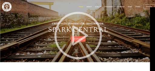
Video Lifts a Lot of Weight on this Page
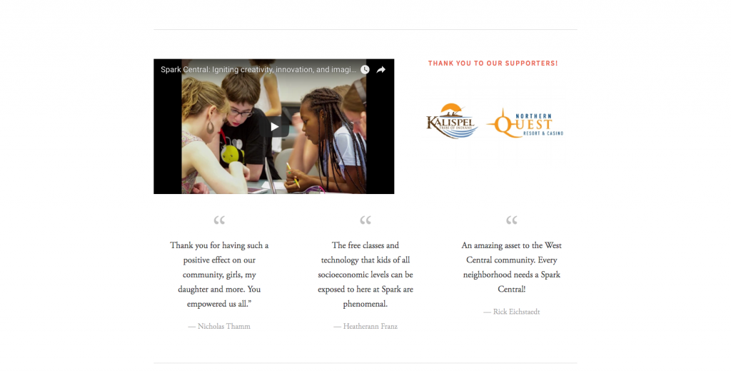
One thing I really liked about the homepage was the explanatory video at the bottom. I felt like this did a really good job of explaining the organization to me and really allowed me to get a feel for what the organization does. My only complaint is that this video element is buried at the bottom of the homepage. If it were me, I would get this as high on the homepage as possible. Video is so vastly superior to paragraphs and paragraphs of text, doing such a better job of not only explaining an organization but also helping me connect to it on a human/emotional level.
Tell Me More of a Story
When clicking through the Spark Central site as a whole I found myself wishing that they were telling me more of a story. Sure, all of the elements of the organization appeared to be accounted for, but what I really wanted to know were things like: what were things like before Spark Central? What impact is Spark Central creating now? What are the big plans for the future? Engage me and tell me why Spark Central is interesting, have an interesting conversation with me. For example, it seems like Spark Central is sensitive to how leery some people can be about expressing their creative side. If so, why not be more direct about communicating this? Why not show me some before/after stories of how people’s lives have been changed through Spark Central? Why not let me hear from a principal who tells me how grades are up, dropout is down, attendance is better? Even better, show me video of all of these!
In a nutshell, I come away from the Spark Central website wanting more. The one video you have is better, I’d love to see videos like those mentioned in the last paragraph. I’d love to see videos of your programs, of a field trip. More than anything, I had a really hard time putting myself inside the organization from viewing the website. In my opinion, there is nothing better than video for accomplishing this. Show me what you are doing rather than only telling me what you are doing.
Surface What Matters
There were several items on the Spark Central website that I loved. Over and over again, though, these items were buried in sub-pages. Like I mentioned earlier, this is backward. In my opinion, curiosity doesn’t drive very much engagement online. Instead, I believe engagement is fueled by generated/created inspiration and interest. Give me something to be interested in and I will engage with you. The problem with great content being buried on the site is that it spends the currency of attention of the visitor before it pays it off with interesting information. If it’s me designing something, I try to flip this on its head. I try to be interesting/compelling first. I try to give to the visitor first before I ask for anything back (e.g. attention, reading, time, etc). In my opinion, websites work best when they give visitors a direct reason to continue engaging with them. By requiring your visitors to supply their own reasons, you do not engage with visitors as much as you could.
Case in point, there is a line on one of the subpages that has someone describing Spark Central as a “library of the future”. A big lightbulb went off when I read this, in that I really “got” what they were doing. Immediately, I asked myself: “why isn’t THIS the headline for the homepage?!”. This was the basic understanding I was so wanting. These four words allowed me to finally understand, on a basic level, what this organization was, but it took me reading several pages to find it in a fairly obscure place.
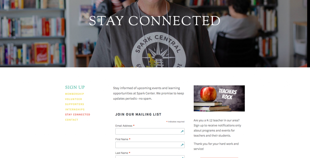
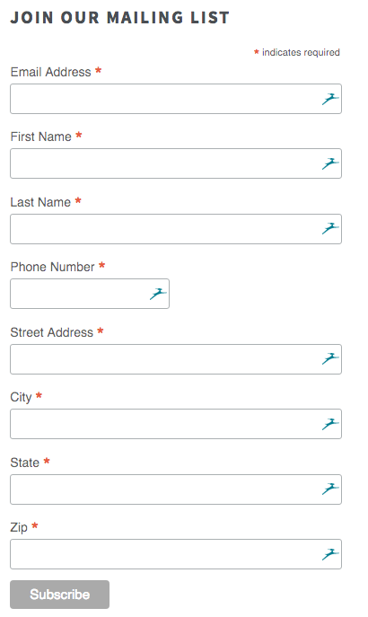
And, this obfuscation happens not only with content but with the newsletter signup too. In fact, I have actually gone to the Spark Central website in the past looking for a newsletter signup and because I couldn’t find it, I assumed they didn’t have one. They do, in fact, but it is buried on a subpage under “Sign Up”. I would never have thought to look there, mostly because I didn’t want to sign up yet, I wanted to stay in touch. I never looked under the “sign up” page in the navigation because I was on an information forage. To me, “sign up” is like a “buy now” button on an ecommerce site. It signals wanting to complete a transaction, sort of the opposite mindset that I was in. What was the most baffling was that the newsletter was not even on the “News” page. This ‘sign up’ subpage is the only place it exists (not in the site footer, not on the contact page, and not even on the news page). It blew me away.
And, why so many fields on this form? If it were me, I would only ask for as little as possible. Like I say in the video, every additional form field adds “friction” to filling out the form, so only ask for what you need (if it were me, it would be a footer form with only the email address and first name).
Out of Order Online Donation Content
Overall, I found the online donation process (provided by a third-party, kindful) to be quite smooth and intuitive. However, my issue with the online donation process is that it too presents content to me out of order. That is, it tells me about all the ways I can help and how help is appreciated only after I hit the donate button. I don’t get this anywhere else on the site, and it is only AFTER I have signaled my intent to give you money that I read it. If it were me, I would present this BEFORE people hit the donation button, making it clear on the site not only the impact you are creating but how you need my help to do even more amazing things.
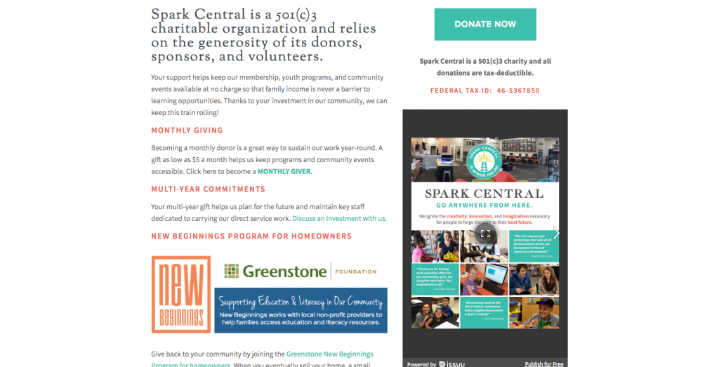
This type of presentation to me reads like they don’t actually need donations. When I read about their corporate sponsors, and nothing on the site seems to be asking for anything (or, presenting an opportunity to join in with a donation), I assume that they don’t really need individual donations. Of course, this is probably erroneous, but this is what this sort of presentation says to me.
Wrapping Up
OK, I feel like I have been hard on this site, but I promise, this is just tough love. I’ve seen what Spark Central is, which makes the tiny shadow of itself that I see presented online frustrating. Like a lot of modern sites, directness in communication can be easily compromised by trying to be too vague and mysterious. To me, the Spark Central website could be so much better, and be such a better representation of what they really are, if they were more direct with their communication, if they drew me in by giving me their most fascinating content/information first, and if they used video and other elements so that I could put myself in the room and really see myself there. If these things were done, I think that “Donate” button would get plenty of action.