Video Review:
Text Review:
Communities in Schools Washington’s website design is dated. They know this, practically anyone looking at the site knows this. What’s interesting is that there are things this site still does pretty well, namely, it explains exactly what the organization does and what impact it creates. Like what has been mentioned in a prior review, with modern website design, it can be easy to get lost in a great aesthetic and lose the critical details that people want from you.
Clearly Stating the Thesis Statement & Impact
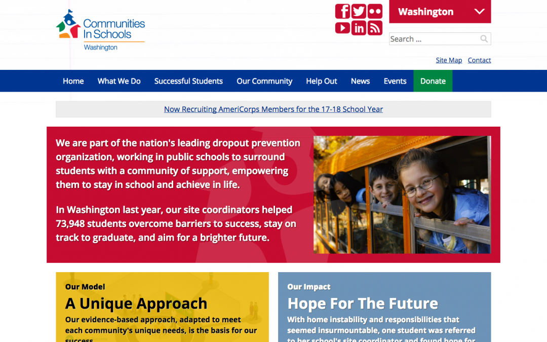
Perhaps the thing I like most about the site is how they state their thesis statement, and their overall impact, at the very top of the homepage. It may sound silly, but so many websites forget to state the obvious on their homepages, choosing instead to try and be compelling through flowery language and vague headlines. Personally, I’m a big fan of direct communication and when I come to a website, I love to see it say what it does (and why I should care) immediately.
For a homepage with very little photo/video, the page is nicely succinct. It seemed to me that the homepage organization/design was aiming to tell me the 50,000-foot highlights in the top (red) section, tell me how they worked in the gold section, and show me more group-specific impacts in the blue section. I am partial to this style of story-telling, especially on homepages, because it nicely summarizes the core information about an organization in an easy to follow, three-step model. However, this is not exactly how this information was presented here, which caused me to be a little confused once I got to the content linked to from the blue box (personally, I would have much rather have this be linked to the “achievements” page, and have personal stories featured throughout the site). I go over this much more in the video above, but the summary is that the blue box linked me to a single personal story, which even though it is a great piece of content, it really left me wanting more of the summary information about the organization.
Communicating in All Directions
When building a website it can get easy to get lost in the vertical organization of the content. You have your main pages, your subpages, etc. What gets overlooked sometimes is how people travel across your website, horizontally.
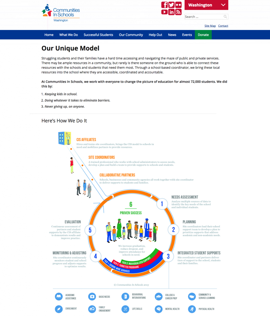
When linking from the homepage to the “Our Model” page, I was presented with some nice summary information and a great infographic. This graphic really helped me engage with the moving parts of the organization, and inputs/outputs were a lot easier to discern and identify with. However, I was surprised that I didn’t have a link or any connectivity to the “impact” page referenced on the homepage. For me, this would have really paid off the mechanical description I just read (and, again, this seemed to be how the flow of the site was structured from the homepage).
This is actually an area where I think the whole site could be improved, with much more cross-linking. I talk about this in the video a lot, but for things like the example here, or some linking between donating and volunteering, it seems to me that the site content could be conveyed a lot better if people could click from one related page to another. Again, the site is organized very well “vertically”, but I would have liked to have seen far more “horizontal” links across the site, allowing me to follow paths across different verticals.
Video, Video, Where for Art Thou Video?
Communities in Schools is a website/cause that could REALLY benefit from video. As seen in the review of Homeboy Industries, video has a way of personalizing a message and helping people connect on a human-level with a cause.
Especially with the personal stories on this site, video would really add another dimension to their story-telling. Human faces have an amazing ability to cause us to connect with what the video is saying, and this type of content used in their personal stories would really allow website visitors to connect more deeply with what they are doing.
Additionally, video creates stand-alone vignettes that can be used throughout the site. These sorts of bits of content are great to break up content on other sections of the site, as well as reinforcing what the content on the page is saying.
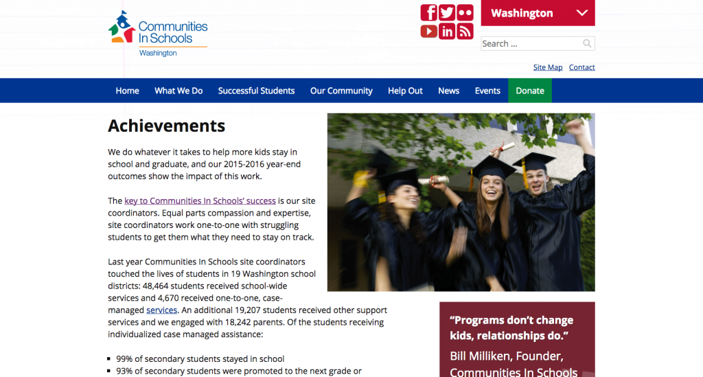
Nowhere is the absence of video more striking than on the “achievements” page. This page talks about high-level statistics of the impact Communities in Schools is creating, and in my opinion, video would really take this to another level and allow the impact to really hit home.
That Donate Page Though…
In the video it’s clear that I am no fan of their donate page. To me, this left so much on the table and simply fell down on the job. My biggest issue with this page is how obviously disjointed it is with the rest of the site, using about as plain vanilla of a design as possible. On top of that, the form felt overly long to me and it buried its best functionality (the ability to really customize donation amounts and timings).
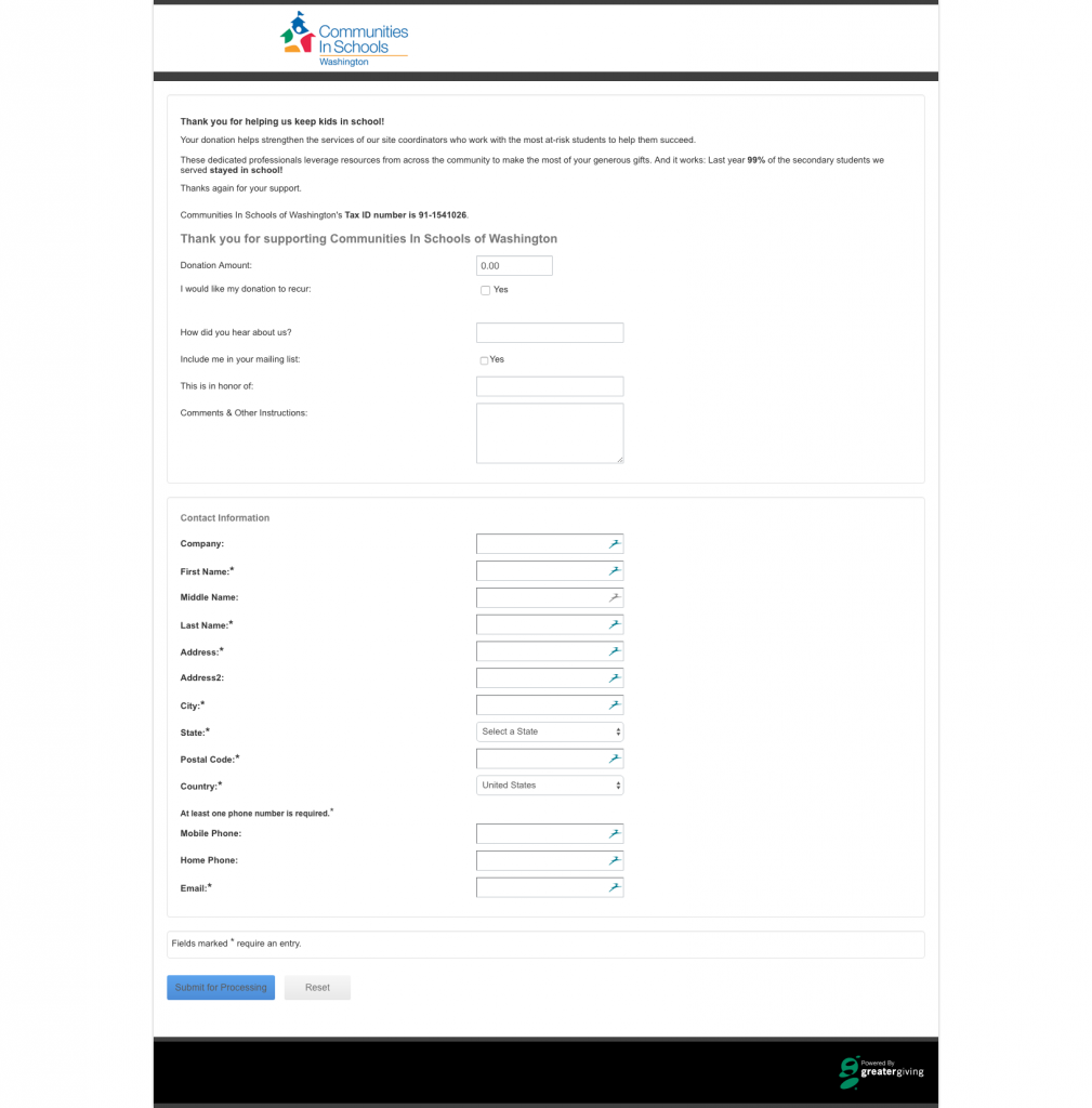
Obviously, this page/service is provided by a third-party (“GreaterGiving“), so Communities in Schools would have no control over how it works. Also, it’s definitely possible that there are other real benefits that they are getting from this service that I cannot see. However, in my opinion, this page is introducing friction to donations, which I would try to avoid as much as possible. There are lots of third-party donation “engines” for sites, and I would have to think that there is another option that would provide the same functionality without the steep trade-offs.
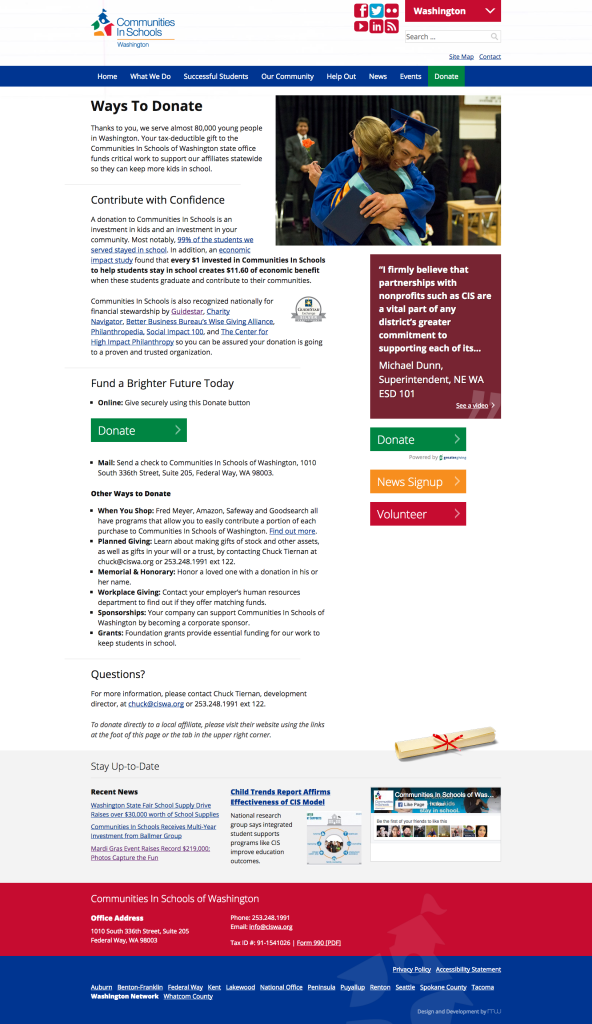
If it were me, I would actually make the “Ways to Donate” page my “Donate” Page. This page, to me, is far stronger, albeit still in need of some reorganization. If it were me, I would move the donate button to the top (and have the donate form slide-out on the same page), and I would move the (great) “Other Ways to Donate” content to the top of the page, on the right (in place of that stock photo).
Don’t Make Me Work to Help You
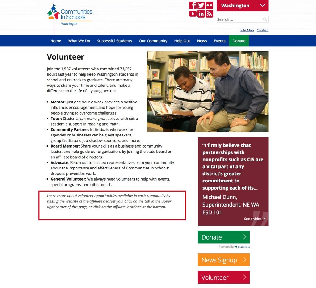
OK, last gripe, I take a little umbrage with the “Volunteer” page. This page has great content on how I might be able to volunteer, giving me ideas I hadn’t even thought of. And, if the content does its job and I want to volunteer, I am left with the vague guidance that I need to find my local organization (without direct links to do so). This page would be SO much better if it paid off my intent to volunteer with easy “onboarding”. That is, if the page made it easy for me to find opportunities that I might be a match for. As a potential volunteer, I would be so much more enthusiastic if I was invited in, if more of a red carpet was laid out for me to simply follow to get involved.
Wrapping Up
Even though the design of this is dated, there are clearly things it does well. Namely, explaining who they are, what they do, and the high-level impact they create. But, like a lot of sites, there is still ample room for improvement, especially when it comes to connecting the site pages horizontally, improving the donation form/page, and if at all possible, integrating video to really make the personal stories hit home.